Lost World is a fictional dinosaur zoo featuring engaging and hyper-realistic holograms and prehistoric ecosystems. It’s a breathtaking experience that’s fun and educational for all ages.
THE PROBLEM
Busy parents and workers want to plan their visit ahead of time.
THE GOAL
Design an app for Lost World’s guests to plan their visit from home — from planning to ticket purchasing — so there’s more time to enjoy the attractions at Lost World.
MY ROLE
UX designer designing an app for Lost World from conception to delivery.
RESPONSIBILITIES
Conducting interviews, paper and digital wireframing, low and high-fidelity prototyping conducting usability studies, accounting for accessibility, and iterating on designs.
User Research
Summary
I conducted moderated and unmoderated interviews and created empathy maps to understand the users I’m designing for and their needs. A primary user group identified through research was parents who valued their time, as they are constantly on-the-go with work and familial responsibilities.
This user group confirmed initial assumptions about Lost World’s primary visitors, but research also revealed that they also do not want to feel lost or waste their time while visiting Lost World.Additionally, this group valued learning something new with their kids.
TIME
Parents value their time due to a busy schedule.
ACCESSIBILITY
Most zoo apps lack multi-language settings and playback.
FLOW
Parents want defined call-to-actions and the most straight-forward process possible.
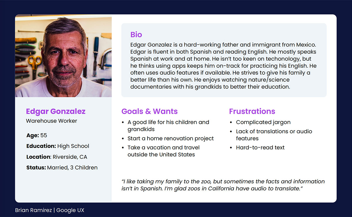
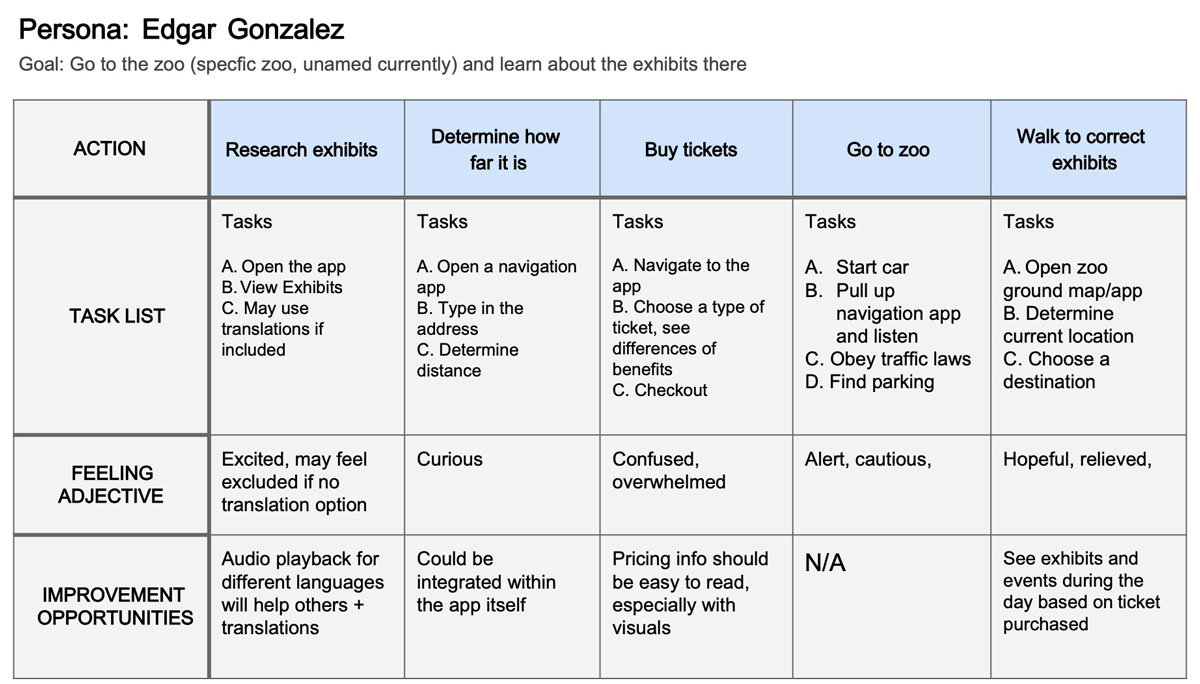
Persona & User Journey
Edgar Gonzalez’s user journey revealed how helpful it would be for users to have access to a planner when visiting a zoo. In Edgar’s case, we also insights into more inclusive accessibility through language and audio playback.
Early Designs
Wireframes
Paper Wireframes
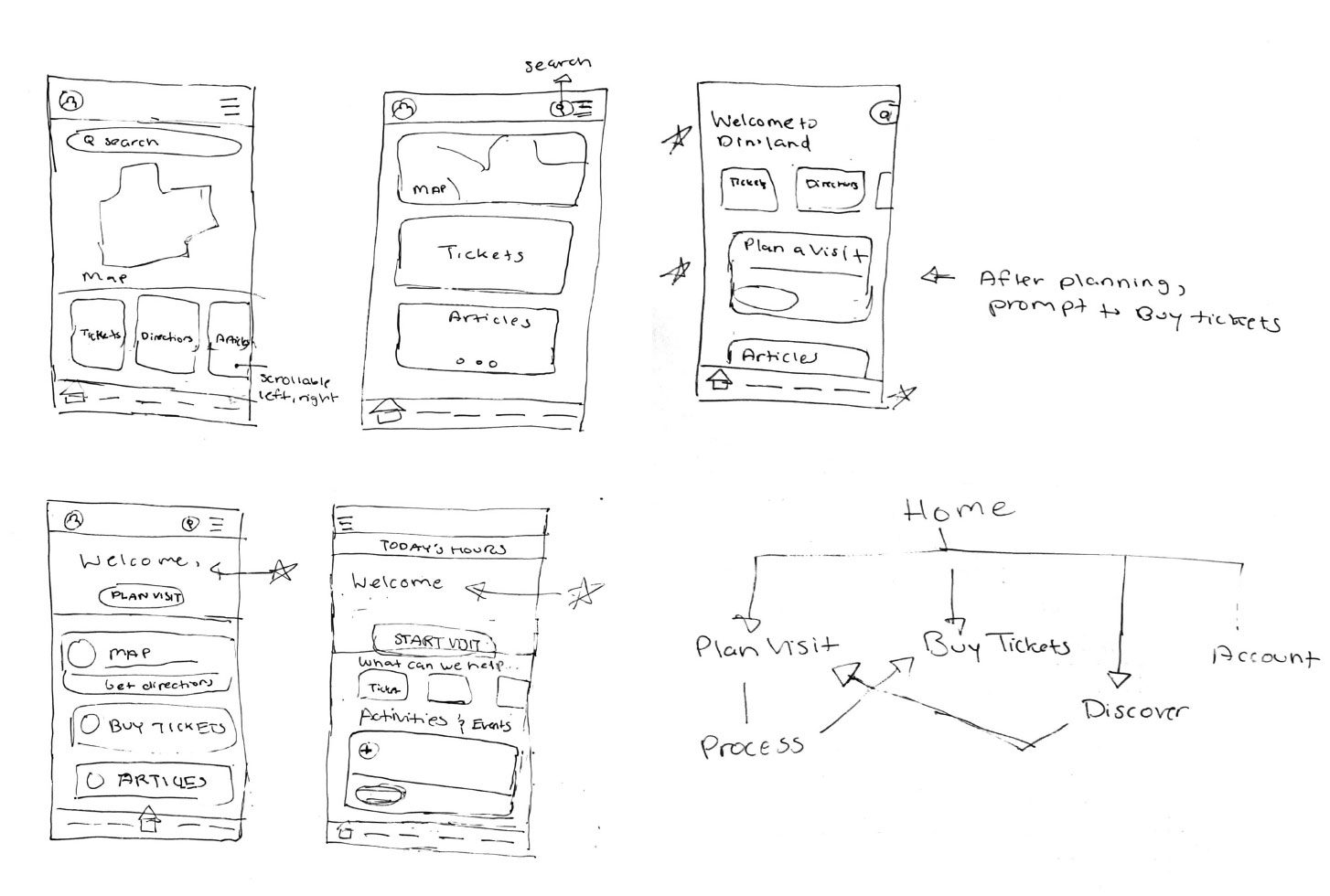
I started the design phase with paper wireframes. I was hesitant on the existence of a menu – I wanted to avoid redundancy with the navbar. The main goal here, however, was an obvious call-to-action that would begin the planning user flow. I wanted to greet the user with some personalization/engagement as well.
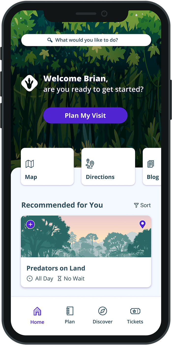
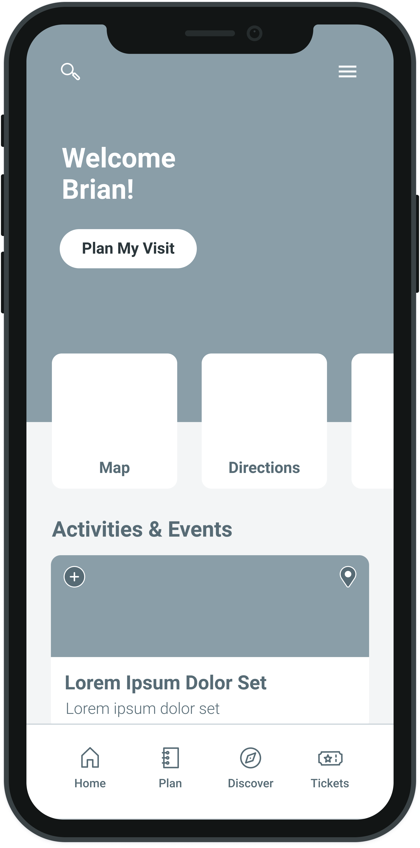
HOME
As the initial design phase continued, I made sure to base screen designs on feedback and findings from the user research.
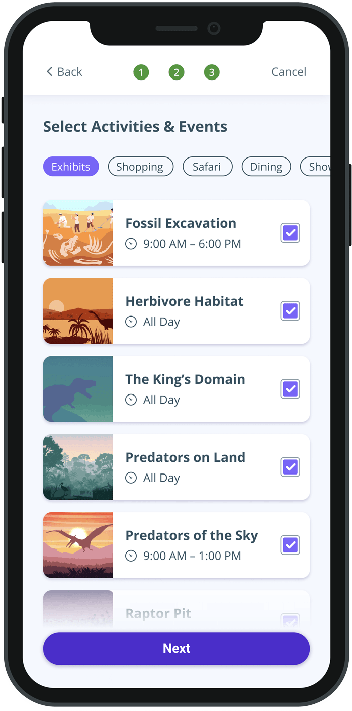
ACTIVITIES & EVENTS
For the activities and events list, I focused on legibility and different ways of easily navigating through the various categories. A horizontal scrolling section saved vertical space and seemed to be a straightforward process based on my hypothesis.
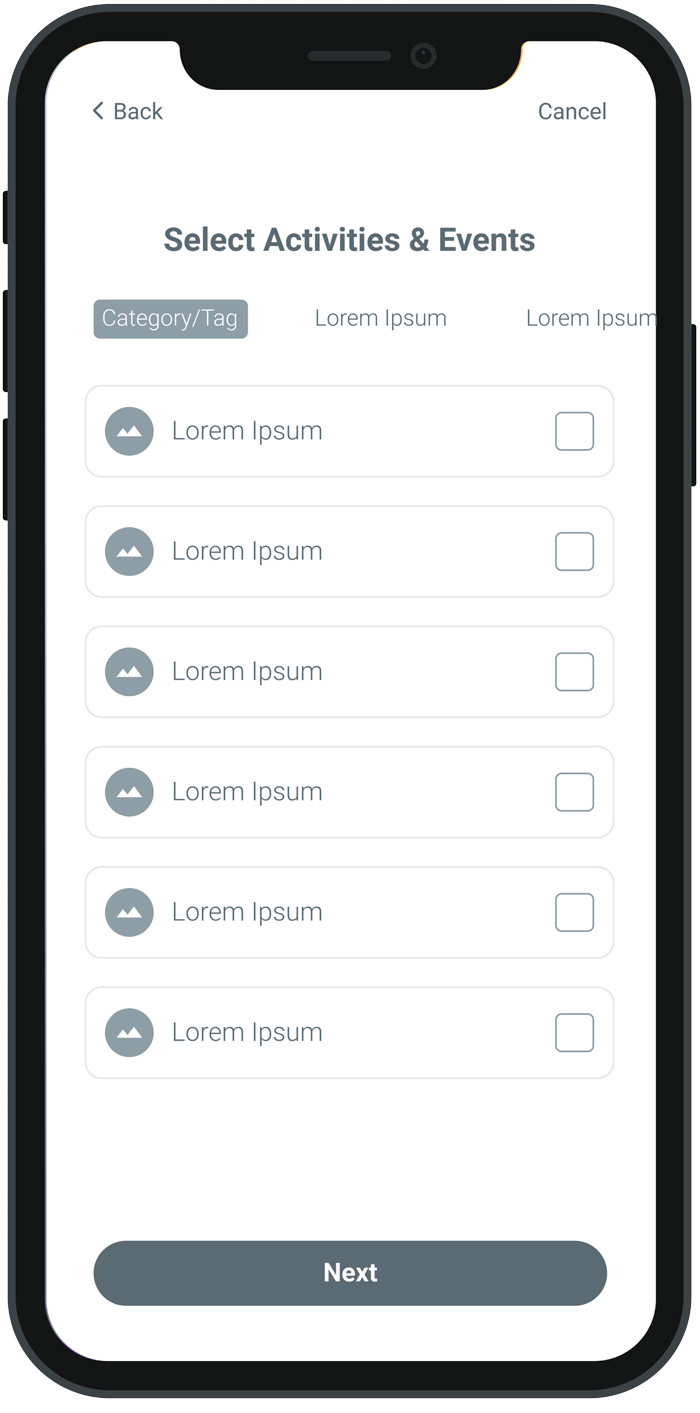
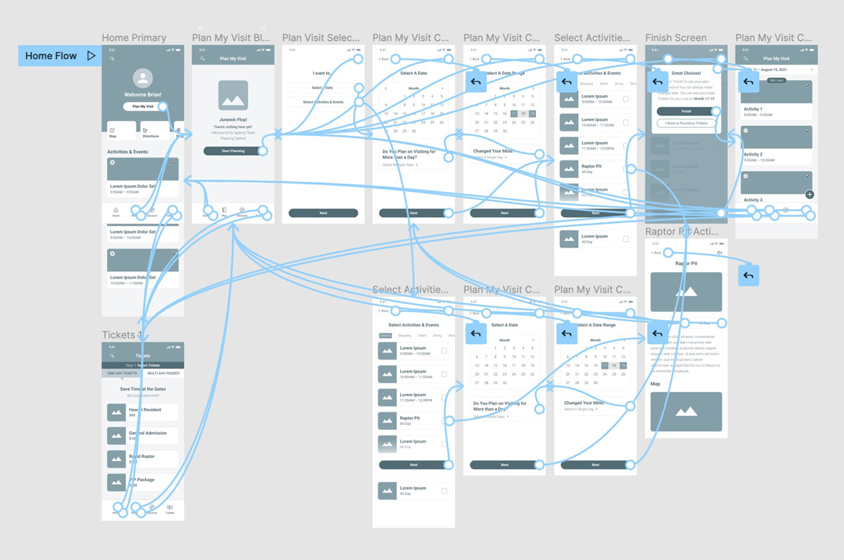
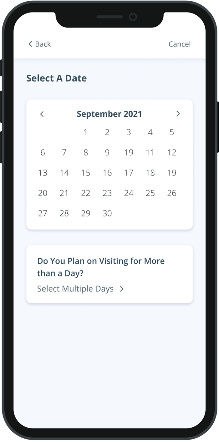
Low-Fidelity Prototype
Using the completed set of digital wireframes, I created a low-fidelity prototype. The primary user flow I connected was the Planning feature.
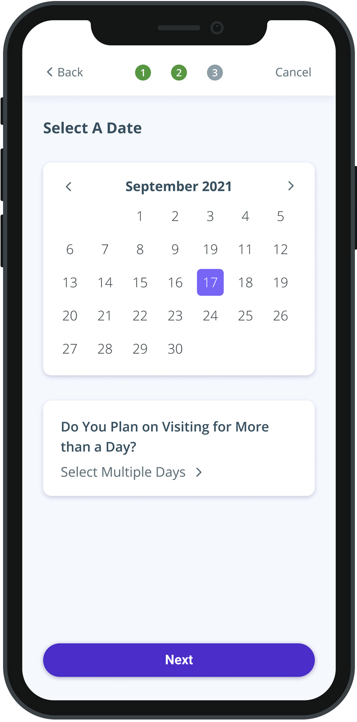
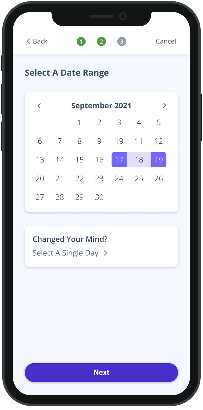
The usability studies concluded that some users wanted to see a confirmation of their selections before they proceeded to the next step of the Planning user flow. Additionally, they wanted to see visuals that indicated how far they are in the process.
BEFORE USABILITY STUDIES
AFTER USABILITY STUDIES
High-Fidelity Prototype
The final high-fidelity prototype presented better visual queues for progression and selections, while delighting the user with subtle animation.
Added language options for playback within the app itself in longform sections.
2
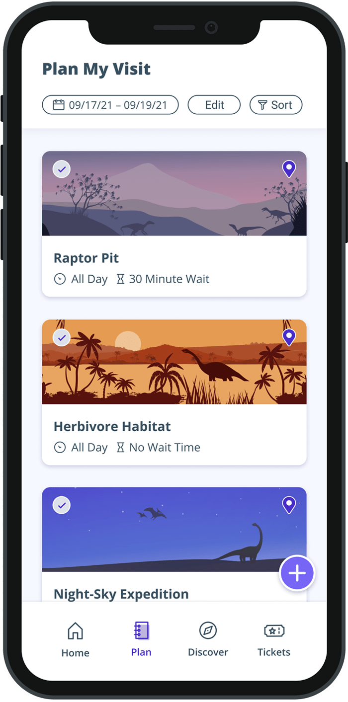
Accompanied important key info with icons for better scannability.
3
Used Stark to verify if color palette passed contrast tests on all major UI components.
Going Forward
Takeaways
IMPACT
The app makes users feel like Lost World pays attention to its diverse audience by supporting multiple languages and inclusivity in design choices.
WHAT I LEARNED
Designing this app made me realize how inclusive design in the planning phase makes a substantial difference in improving the UX for all users.
"The app looks and feels amazing to use. Super simple! It makes me wish this really existed, I’m sure this would be handy before and during the visit!"
PARTICIPANT B
Parent, High School Teacher
Next Steps
Conduct research on pain points for users within the checkout process.
Integrate a checkout process to start expanding out the app’s primary user flow.