This website is a fictional privatized space agency that offers commercial space travel, including a mission to Mars. The primary call to action leads to the main user flow, Mission Maker.
THE PROBLEM
Current space agencies lack a direct and immediate process for space travel inquiries. Typically, there's a form that requires a representative to contact the lead, which creates a waiting period for the user.
THE GOAL
Design a simple user flow that quickly calculates a precise trip estimate based on user requests, add-ons, and filters.
MY ROLE
UX designer designing a fully-responsive website from conception to delivery.
RESPONSIBILITIES
Conducting interviews, paper and digital wireframing, low and high-fidelity prototyping conducting usability studies, accounting for accessibility, and iterating on designs.
User Research
Summary
I conducted moderated and unmoderated interviews and created empathy maps to understand the users I’m designing for and their needs. A primary user group identified through research was wealthy individuals, who dreamed of space exploration.
This user group confirmed initial assumptions about SOAR’s primary visitors, but research also revealed that they would like to see prices and process information as clear and concisely as possible before making a purchasing decision.
TIME
Users want to avoid waiting periods and get a trip estimate as soon as possible.
CLARITY
Users want clarity in images, pricing, etc. so they know what to expect.
FLOW
Users want defined direction, to be guided to the main user flow.
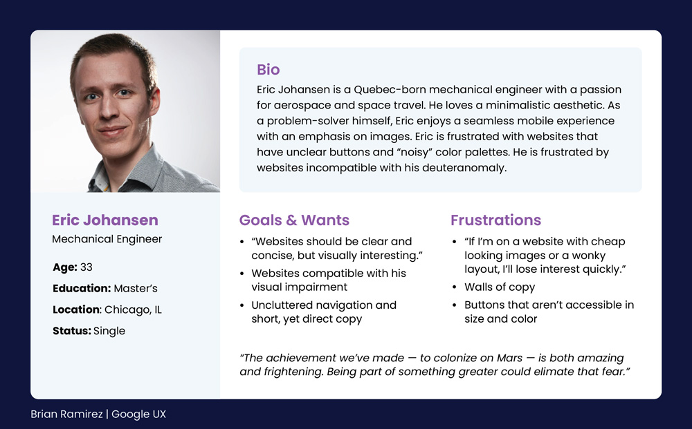
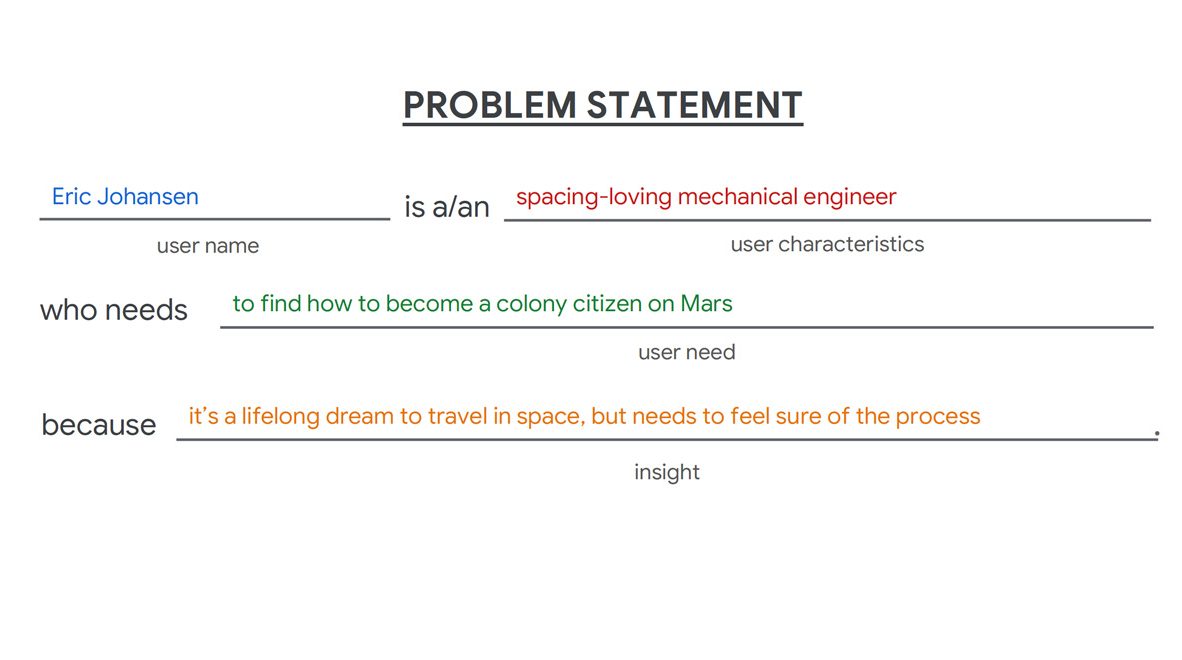
Persona & User Journey
Eric Johansen’s user journey demonstrates waiting for a call or email back is the main pain point to be resolved. If this step could be automated in the user flow, it would be ideal and improve the user experience, fulfilling the user's needs in the process.
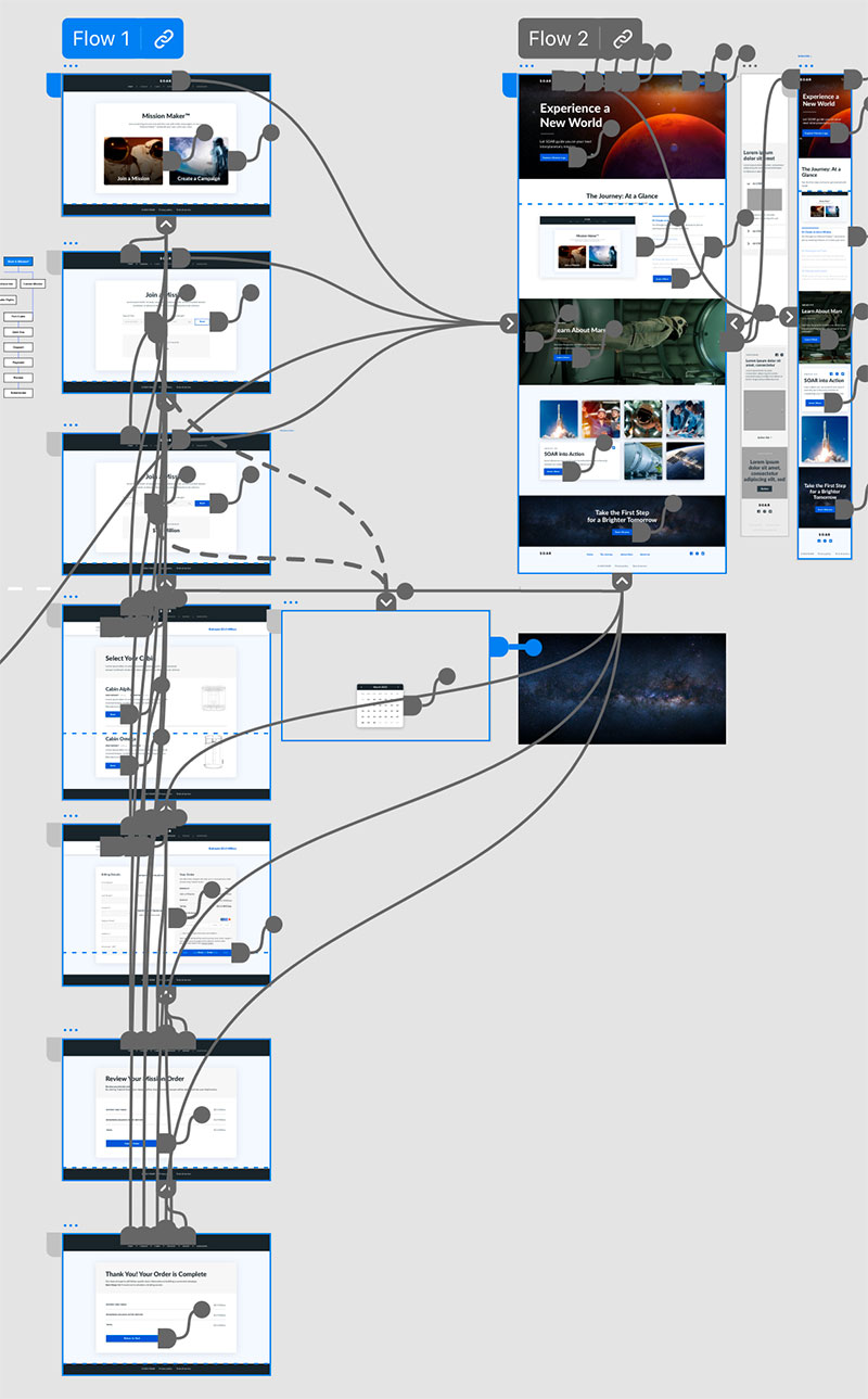
Information Architecture & Early Designs
Wireframes & Low-Fidelity Prototype
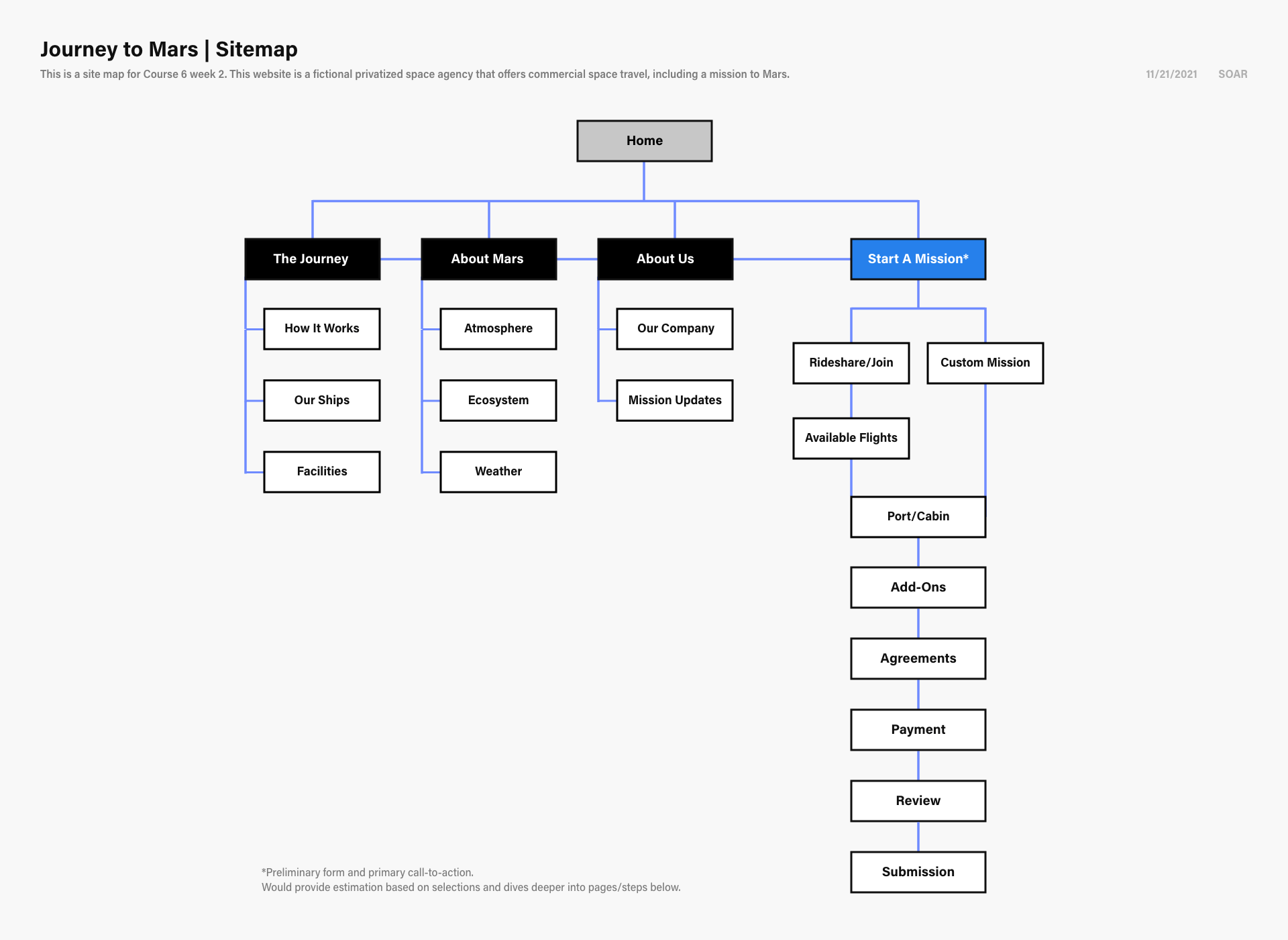
SITEMAP
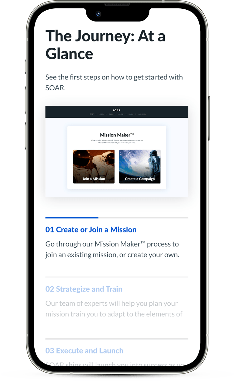
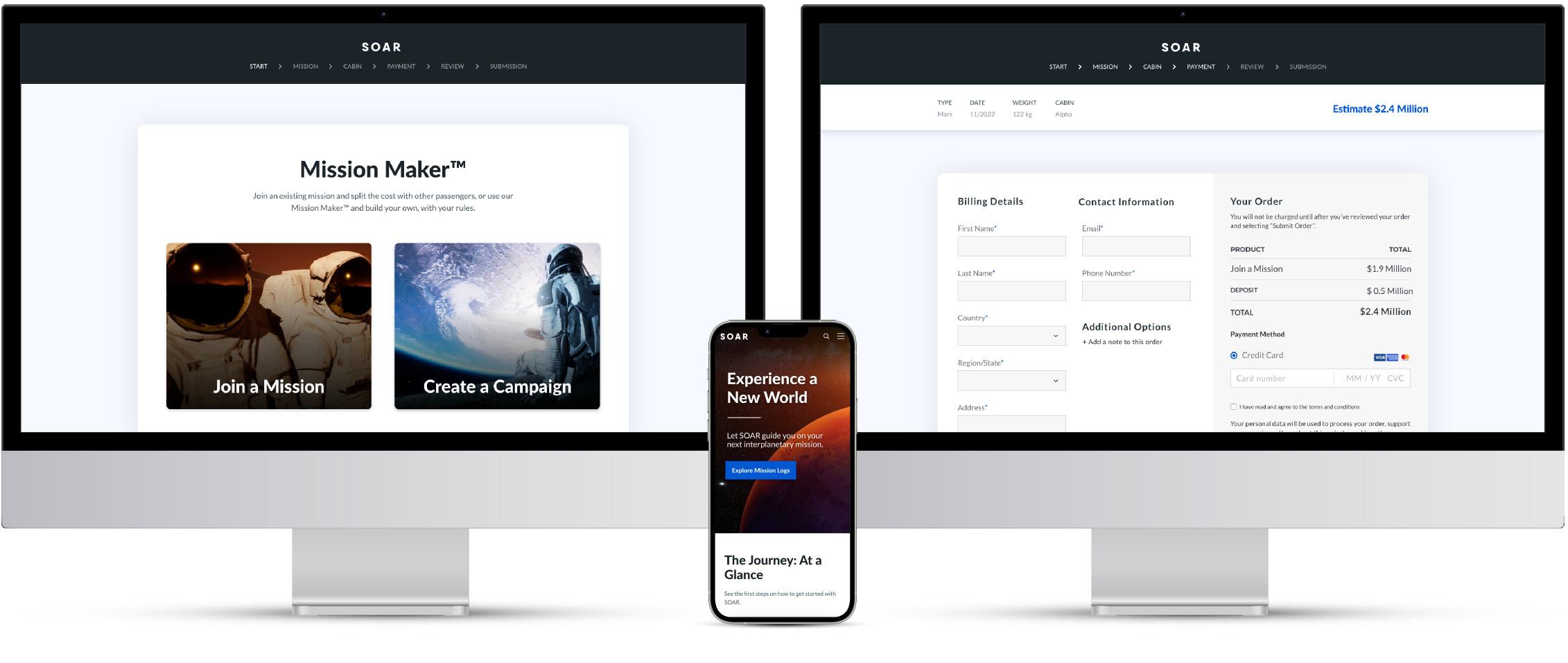
"Start a Mission" is the primary call-to-action. The plan is to have it accessible in the navigation, so it's available at all times.
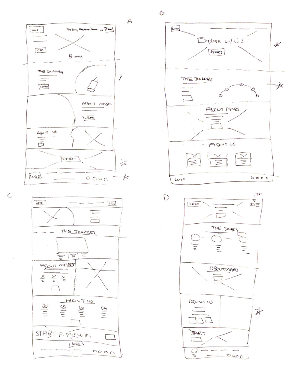
Paper Wireframes
I wanted each section to be linked to the parent pages of the website. Then, users can go deeper down that section if needed. Defined/consistent CTAs and reflective photography were in mind as well.
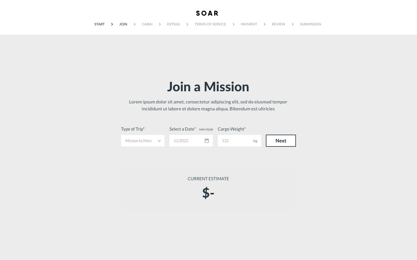
JOIN A MISSION
The second step of the main user flow. By inputing just a few fields, users can get an instant estimate, moving forward will update the price based on new extras or filters.
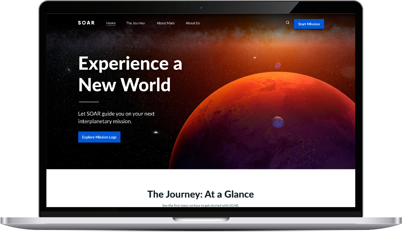
HOME
As the initial design phase continued, I made sure to base screen designs on feedback and findings from the user research. There is a clear call-to action to start the planning process.
Findings
1
Users want to see estimated prices
2
Users want to the option to create and join missions
3
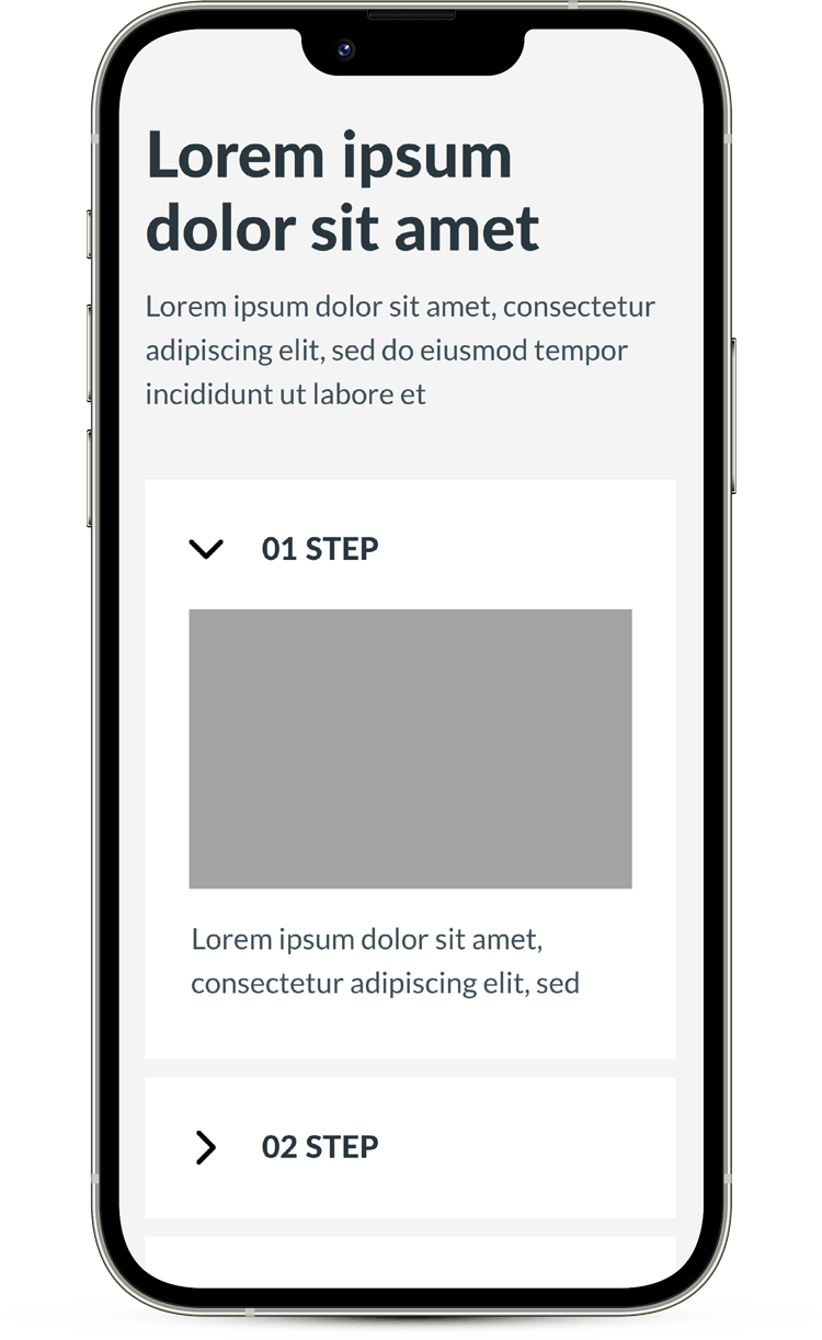
Users wanted a process breakdown
4
Users want progress bars/steps for the planning process
5
Users want a clearer indication of their selections
3
Users wanted a process breakdown
Refining Designs
Usability Studies
Certain components of the design were requiring the user to interact with its elements in order to see certain contents. This means users could potentially miss those points of interaction. After the second round of usability studies, new modifications include more opportunities to interact, for example components playback video automatically while allowing users to manually proceed as well.
BEFORE USABILITY STUDIES
AFTER USABILITY STUDIES
Key Mockups
HOME
PRIMARY USER FLOW
High-Fidelity Prototype
The final high-fidelity prototype presented better visual queues for progression and selections, while delighting the user with subtle animation.