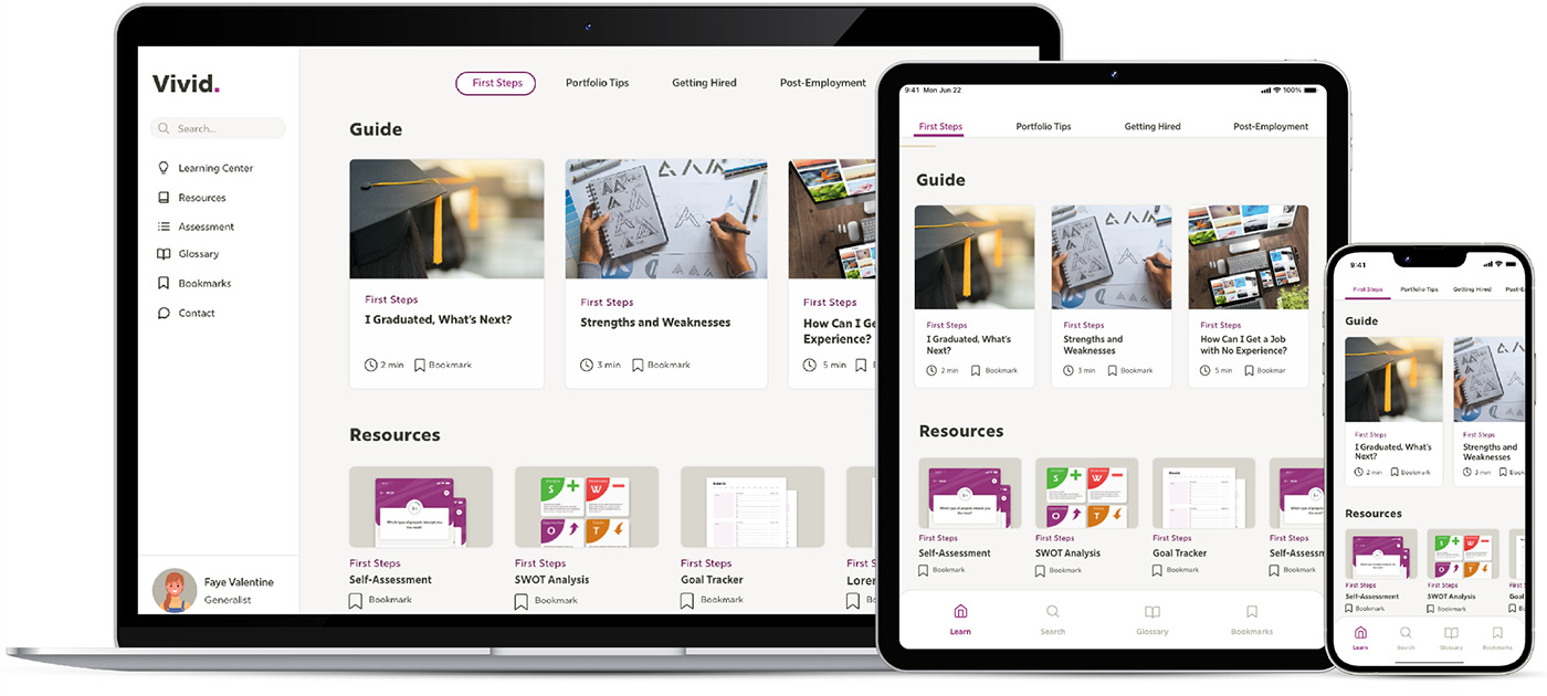
Vivid is a non-profit app containing tips, information, and resources for new designers and fresh design school graduates.
THE PROBLEM
New designers and fresh design school graduates lack direction of what to do after college, or starting their career in general.
THE GOAL
Vivid compiles a series of free resources for designers to read and reflect on, with the aim to get new designers on their path to success.
MY ROLE
UX designer designing an app and responsive website for Vivid from conception to delivery.
RESPONSIBILITIES
Conducting interviews, paper and digital wireframing, low and high-fidelity prototyping, conducting usability studies, accounting for accessibility, and iterating on designs.
User Research
Summary
I conducted moderated and unmoderated interviews and created empathy maps to understand the users I’m designing for and their needs. A primary user group identified through research are young adults and students who don’t know where to start after graduating.
This user group confirmed initial assumptions about Vivid’s primary visitors, in addition they want to be able to refer to any resources easily. A “favorites” feature was mentioned by some of the group.
Pain Points
EDITABLE RESOURCES
Users want resources they can markup
CLARITY
Users want straightforward, unbiased and relatable advice — that school never taught
ORGANIZATION
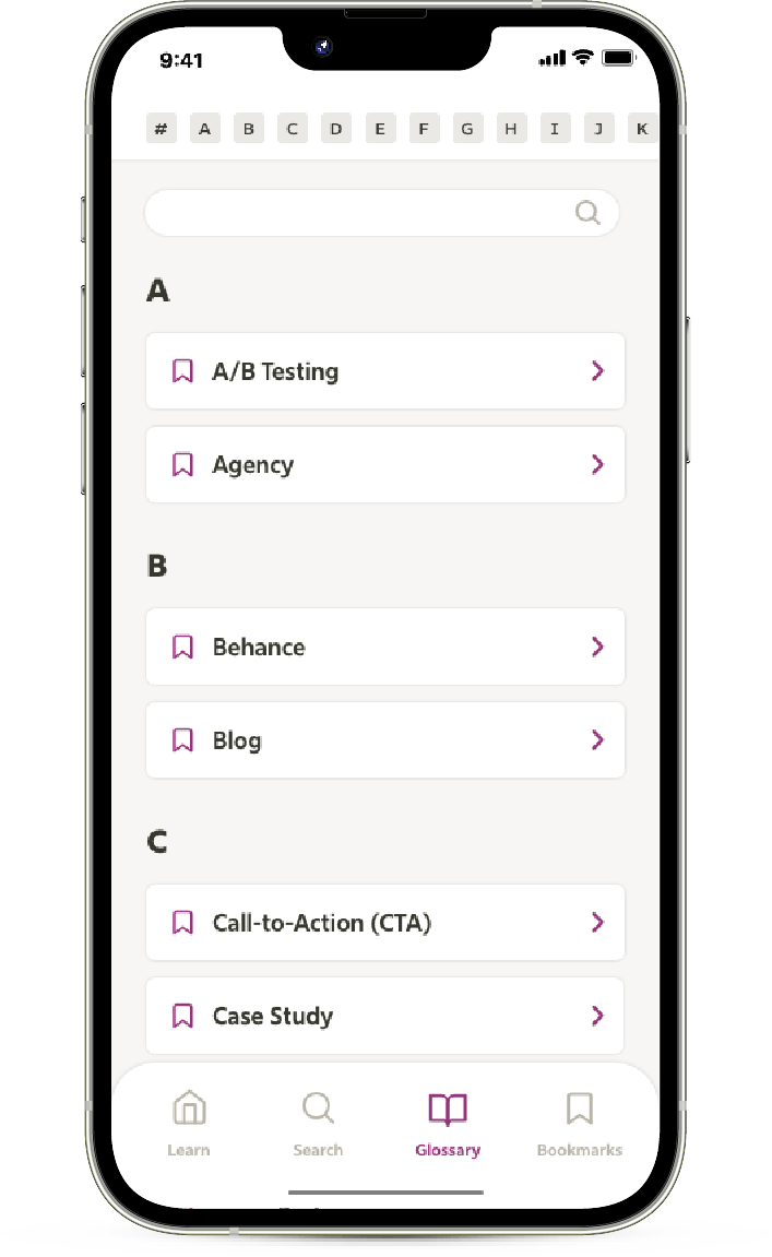
Users want to be able to filter content and navigate easily
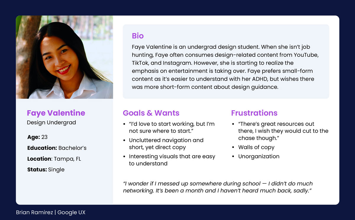
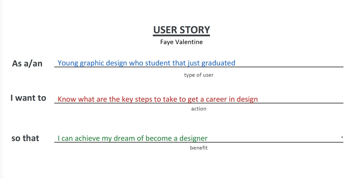
Persona & User Story
Faye Valentine’s user story provides insights on what students are looking for in terms of guidance and resources.
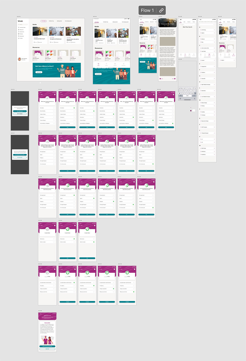
Early Designs
Wireframes & Low-Fidelity Prototype
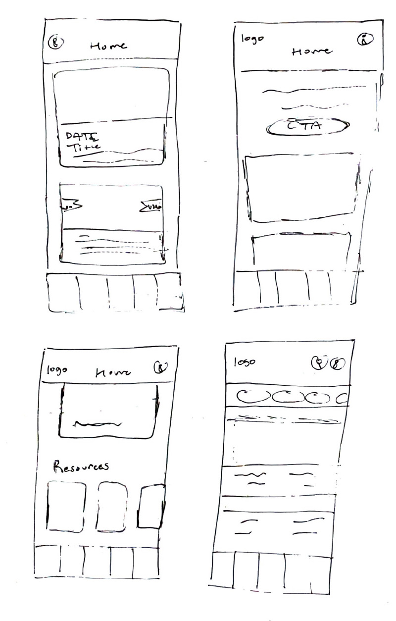
Paper Wireframes
As my primary user group is comprised of mostly young adults, a focus on card-style navigation would be effective and familiar to users. In addition, some type of secondary nav is required to filter or break up the content by category, so the user does not feel lost or overwhelmed. Going in a step-by-step process would be ideal.
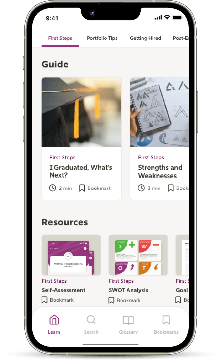
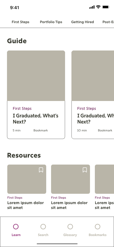
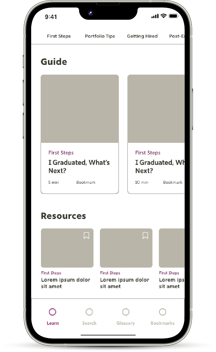
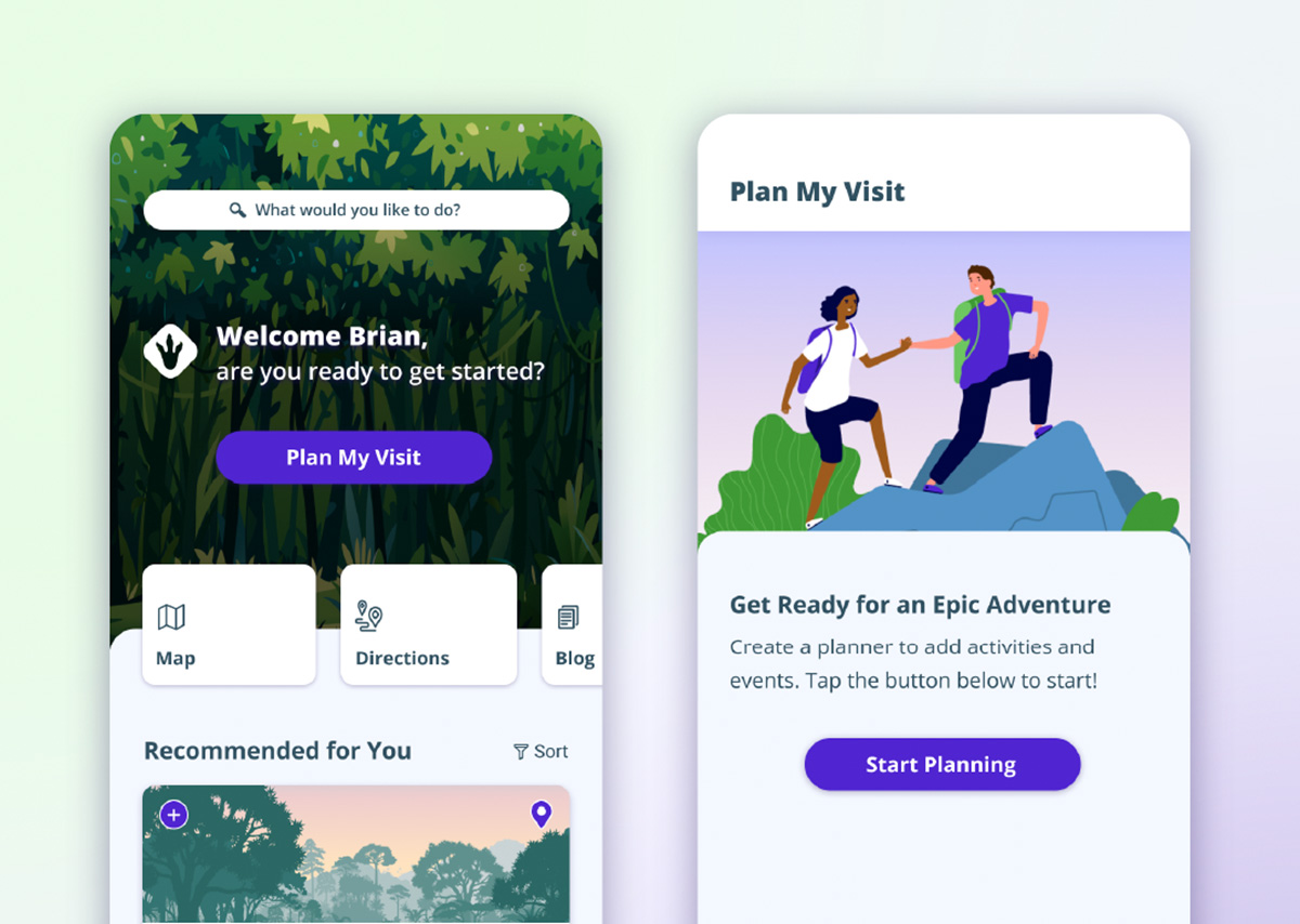
HOME
Initial designs are consist of several horizontal scrolling navigations in order to conserve space. Sliding navigation breaks up the content based on type, while maintaining a familiar card-style base UI.
Self-Assessment
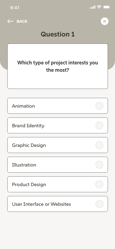
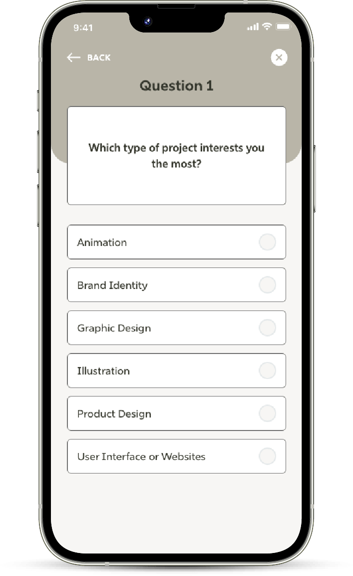
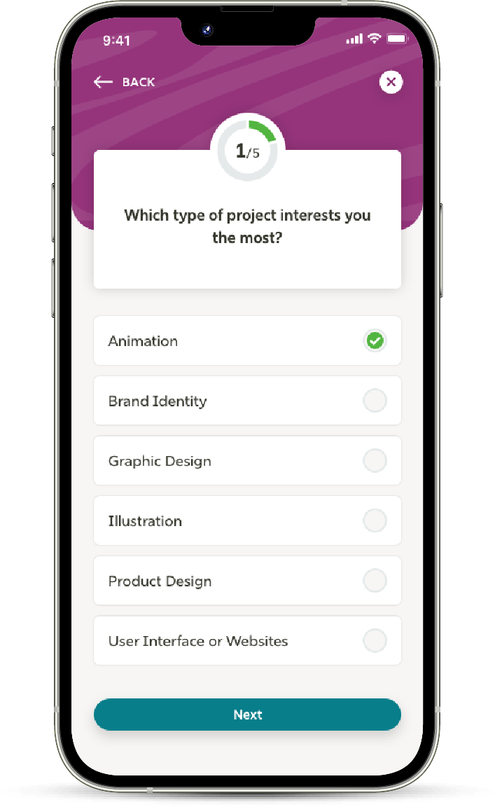
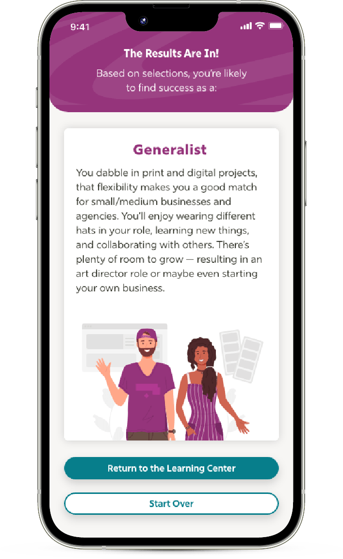
This is the initial low-fi version of the assessment, the primary user flow of the app. This helps designers reflect and identify what they may enjoy or specialize in, and even determine an ideal work environment/setting. Users can navigate forward, backward, and quit the process. Additionally, the radio selection ensures only one selection can be made at a time.
Findings
1
Need more clarity for what page user is on (clear indicator)
2
Need more clarity in selections (self-assessment user flow)
3
Users would like to know estimates for reading sessions (in minutes)
Refining Designs
Usability Studies
Iconography was added in the highfidelity prototype. Additionally, an indicator bar was added that reflected which category was in selection. Icons were also added to the estimated timeslots and bookmark feature. The bookmark icon was moved out of the box on resources, as it was throwing users off based on its location for Guide.
BEFORE USABILITY STUDIES
AFTER USABILITY STUDIES
Usability Studies: Self-Assessment
Early designs lacked a progress indicator, and the Next CTA now gives users a confirmation of their selection, requiring to tap it to move onto the next question. CTA was also made sure to have an ideal contrast ratio for accessibility and legibility.
BEFORE USABILITY STUDIES
AFTER USABILITY STUDIES
Key Mockups
High-Fidelity Prototype
The final high-fidelity prototype presented better visual queues for progression and selections, while delighting the user with subtle animation.
The app makes users feel ready to tackle the first steps at starting their upcoming design career.
WHAT I LEARNED
Progression indication is a key component in a user flow. Having that information is valuable as clarity and may compel users to complete short tasks with confidence.
“The app looks nice and familiar. I like that everything is fairly short and organized well. It covers topics that are valuable to me. The assessment is useful, I’d like to see all the possibilities at some point!”
PARTICIPANT A
Student
Next Steps
Conduct research on pain points for users on reading sections and feelings towards longform content.
Integrate multiple categories/content and start packing glossary definitions.